DTF Print Color Matching: How to Get Accurate Colors Every Time
DTF print color matching is one of the most persistent frustrations in custom apparel. You upload a file with a clean, saturated design and the finished transfer comes back looking flatter, slightly off-hue, or different from what you expected. The disconnect often has less to do with printer quality alone and more to do with file prep, profiles, fabric, and press settings. Three variables on the customer and application side matter most: how your file is prepared, what fabric you press onto, and whether your heat press settings are correct. Get all three right and results become predictable.
Why DTF Colors Look Different Than Your Screen
Your monitor displays color in RGB, a light-based model. Most DTF workflows use CMYK inks plus a white underbase. These are different color systems with different reproducible ranges.
Colors that look vivid on screen, particularly electric blues, neon greens, and deep crimsons, often fall outside what CMYK inks can reproduce. When your file is processed, those out-of-gamut colors shift to the nearest printable match. If you design in a standard RGB workspace without color profile awareness, that shift is uncontrolled.
There is also the white underbase to account for. DTF transfers use a layer of white ink beneath the design colors. On dark garments, this base makes colors opaque and saturated rather than transparent or muddy. Depending on the print workflow, the white underbase may be adjusted for light garments; fabric color can still influence perceived color. Account for this when producing the same artwork across multiple garment colors in an order. The same principle applies to UV DTF transfers, which use a different application surface but rely on the same color-management logic.
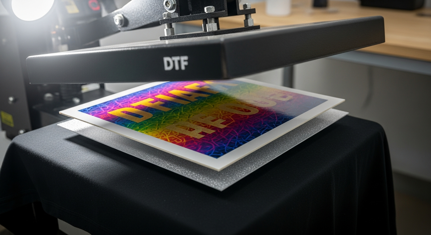
The Role of File Format and Resolution
This is where most color problems start. For DTF Jersey orders, transparent PNG at 300 DPI is required.
JPEG files do not support transparency, so any background in the file may print as part of the design. Submit a JPEG and that background prints with the design, ruining the application on any garment that is not perfectly white. For clean edges and accurate color, the file must be a transparent PNG.
Resolution affects sharpness, gradients, and perceived color quality. At 300 DPI at final print size, gradients and fine details are more likely to print cleanly. Below that threshold, gradients band into visible steps and blends lose smoothness. A design that looks sharp at 72 DPI will look degraded in print.
When building gang sheets, each design must be at 300 DPI at its actual print dimensions, not scaled up after the sheet is assembled. Scaling up a low-resolution design is one of the most reliable ways to introduce color and clarity problems. The DTF Gang Sheet Builder accepts sheets up to 22 inches wide and 200 inches long, and you can also upload a pre-arranged gang sheet at checkout, but the resolution requirement applies throughout. For individual designs sized to a specific dimension, Custom DTF Transfers by Size is the simpler route.
For a full breakdown of file requirements before you order, see setting up your DTF print files.
Fabric Color and How It Changes Your Results
The garment is an active variable in color output. A white shirt and a light heather gray will give slightly different results with the same transfer, because the heather blend mixes visually with areas where the underbase is thinner.
Dark garments get a full white underbase, giving colors an opaque, saturated base. This is why DTF printing produces vibrant colors on black shirts without the per-color setup cost of traditional methods. The tradeoff is a slight thickness to the transfer feel.
Cotton-rich fabrics are often easier to press consistently; polyester can also produce vibrant results but may require testing. Cotton-rich garments often give a softer hand feel; polyester and blends can still work well with correct settings. On polyester and performance fabrics, the adhesive layer interacts differently with synthetic fabrics, and heat sensitivity or dye migration can change the final look. If you are sourcing blanks alongside your transfers, the blank apparel collection covers cotton-rich tees, blends, and a range of garment colors for consistent test runs.
If you are running the same design across multiple garment colors, press one test shirt per garment color before committing to the full batch. For finished-apparel options, Custom T-Shirts, Custom Hoodies, and Custom Sweatshirts are pressed in-house at DTF Jersey, which removes one variable from the equation.
For more detail on how material choice affects application results, see how different fabrics affect DTF results.
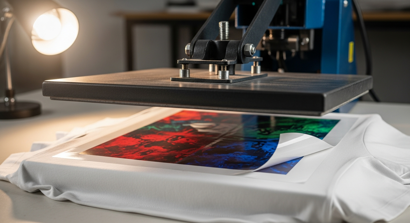
How the Press Settings Affect Color Output
Press conditions are the final variable, and getting them wrong shows up as a color problem even when your file and garment are correct.
🔥 DTF Jersey Verified Press Specs
Under-pressing is one common cause of dull, hazy, flat-looking colors. The transfer needs full heat and pressure to bond the ink layer to fabric. When that bond is incomplete, colors look washed out.
One practical note: the dial on your heat press and the actual platen temperature are not always the same number. Older presses drift. A press set to 300 degrees may be running at 270 or 315 at the platen surface. If your files and fabric are correct but colors are still off, check the actual platen temperature with an infrared thermometer. This often resolves color issues that don't have an obvious file or fabric cause.
After pressing, hot-peel: pull the carrier film immediately after the press opens, with the transfer still hot. DTF Jersey's transfers are designed for hot peel, not cold peel. For DTF Jersey hot-peel transfers, waiting too long can interfere with release. Follow your supplier's peel instructions. A brief re-press after peeling seats edges and finishes the result.
The full step-by-step is in DTF Jersey's DTF pressing instructions.
When Colors Come Back Wrong
Work through these in order before assuming the transfer is at fault.
DTF Jersey's transfers are Intertek-tested for 100 or more wash cycles without major color fading, cracking, or peeling. A common cause of post-wash color shift is incomplete bonding during pressing, but wash method and transfer quality should also be checked. A fully bonded transfer holds color through repeated washing when applied at the correct settings.
For guidance on keeping printed garments looking right over time, see transfer durability and care.
Getting It Right From the Start
Consistent DTF print color matching comes down to three things you control on the application side: clean files at the correct format and resolution, the right garment for the job, and a press running at the verified temperature and time. Address all three and the transfer does what it is supposed to.
Ready for Reliable Color?
DTF Jersey's ready-to-press transfers ship with no minimums, same-day processing for orders placed before 3:00 PM ET, and free shipping on transfer orders over $100.
Shop Ready-to-Press → Build a Gang SheetFrequently Asked Questions
What file format gives the best color accuracy for DTF printing?
Transparent PNG at 300 DPI minimum. JPEG files do not support transparency, so any background may print with the design. Files built below 300 DPI cause gradient banding and uneven color transitions. Build at actual print dimensions before submitting, not scaled up afterward. The DTF Gang Sheet Builder follows the same file rules.
Why do my DTF transfer colors look different on dark shirts versus light shirts?
DTF transfers use a white ink underbase to make colors opaque and vibrant. Depending on the print workflow, the underbase may be adjusted for light garments, so fabric color can still influence how the design reads. Both results can be correct; account for garment color during the design and proofing stage.
What press temperature and time produce the most accurate DTF colors?
Press at 290 to 310 degrees Fahrenheit, using either high pressure for 6 seconds or medium pressure for 8 to 15 seconds. Hot-peel: pull the carrier film immediately after the press opens, then do a brief re-press. Under-pressing is one common cause of dull, hazy color output.
Why do my DTF colors fade after a few washes even if they looked correct off the press?
A common cause is incomplete bonding during pressing — if the transfer did not fully seat at the correct temperature and pressure, the ink layer can release during washing. Wash method, drying temperature, and transfer quality should also be checked. DTF Jersey's transfers are Intertek-tested for 100 or more wash cycles without major fading when applied at the recommended settings.
Does fabric type change how DTF transfer colors look?
Yes. Cotton-rich fabrics are often easier to press consistently and tend to give more predictable color results. Polyester and performance fabrics can also produce vibrant results but may require testing, since the adhesive layer interacts differently with synthetic fibers and heat sensitivity can affect the final look. The blank apparel collection covers a mix of fabric types for test runs.